So been away from this for a while after personal reasons
but now it's all GO GO GO! I decided to take this time to remake the level as I
noticed after walking through my level it was taking a long while to walk
it. Like 6+ minutes which i guess its fine but it felt boring. I found
myself wanting to sprint nearly all the time to just get through it. So I've made the map as small as i could
which has led me with more to play with. I can have my level with more details
in.
First off its the path I want the play to start with. I
wanted a bridge to cross first off. I
found a bridge to be good as it kind of suggests 'this is the path and way
forward' it encourages you to cross it.
It sounds kind of odd but for me
it was a way to invite the player in to the level. I Also wanted the player to
have the goal in their sights from the
start. Like a point of interest. My original level didn't have any of that, it
felt kind of disjointed and not much of a flow.
I'm not really too happy with the transitions from rock to earth so i've made rocks to kind of blend it better and make it more rocky mountain like. Adding tall tree's really gave the level a size and height. I think because the tree's are tall it makes you look around more so i've found that quite useful.
Using the rocks I've found i could create turns and falling areas to block off parts of the level to prevent them going places i don't want. This came very using ful for blocking off the track behind the start so it leaves the player with no one else to go.
Adding rocks around the edge of the terrain helps me break up the edge of the river too and makes it look more interesting that this move edge i would normally get.
I've also added ferns to the level and grass which gives me some kind of ground covered to break it up as well but ill make more foliage to add to it.
Treehouse
The tree house now has its textures which have come out slightly green ish on cryengine i'm not sure if its the lighting thats doing it yet but i'll fix it soon when the rest of assets are adding and can focus on making everything work together.
The insides pretty bare too i still need to add the assets too it but i need to fix some stuff first some of the textures are a bit too big like the floor it looks fine but when in first person they just look too big.
Its too creamy aswell so i'll try fix that too but i think its more in game as my textures are more white than cream.
I've also added the bridge its looking good bit longer than i had wanted it gives room to see the river.
The barn now has a texture too i'm trying to get the windows to cube map still but they have turned really white and flickerly but i'm pretty happy with the colours
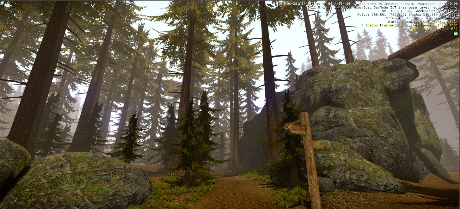
Also logs are now around the level and kind of directionally point the path out for the player to follow.
New lighting
I originally had a a thick fog to the level to kind of block the view distance to the level but it doesn't quite work and makes the level look kind of dull. So i've change the direction lessened the fog and made the light stronger and more brighter and made the sun shine through the trees with its rays which i think mades a more appealing look and theme to the level.
So from the bridge you can see the sun lighting up the tree house in the distance which suggests the point of interest and gives a leading point to go towards.
The land is now sloped towards the rocks which gives natural look like the earth is being pushed and drawn away by the river.
Notice board is now in as well to help guide the player in a direction to go
More foliage is now in oddly its turning blue the further away. I'm not sure why.
Having a weird issue with light bouncing back off objects and lighting up the shadow area of the assets. Its kind of a cool effect but too strong.
This is the little path up to the tree house covers in vegatation. I'm quite happy with this.
The area i had around the tree house was before really dull so i've lighting it up and added a fire area and made it more living which i originally never had in the concept. I'll have to do some more concepting to work this out fully but its coming along.